| |
|
|
|
|
Taking those first steps.....Do you want to create your own designs? Do you have a camera? Have you ever taken a picture of that newly opened rose in your backyard, or the bud waiting to open until just the right moment, tomatoes growing on the vine in your garden, your new baby kitten? Have you ever purchased an apple, or an orange, or a head of lettuce at the grocery store? Have you ever taken pictures of those? If you have, you're well on your way. If not, why not start? We've all seen artists that seem to be able to paint anything from their imagination, a rose, an animal, or a mountain scene with a cabin, a running stream, and big old pine trees. And we're amazed. And it is amazing. And we think we could never be able to do that. But, the truth is, most of these artists have painted the same generic subject matter over and over and over until they could do it in their sleep. I think it is called practice. The true prodigy is fortunate but rare and even they quite often need guidance in honing their talent. I believe we all have the talent or the aptitude to create a design and then paint it. Even some people with physical or mental disabilities have been able to successfully overcome their handicaps to some degree by their desire to succeed. So what is talent? To me, it is a combination of aptitude and desire. Yes, some people have greater aptitude than others. They catch on to things faster. Does that make the person slower to catch on less talented? Absolutely not! Not if they have the desire to succeed by paying their dues, or even working a little harder to reach success. Ok, so we�re agreed. We're not prodigies. Well, at least I'm not. I've worked hard to learn to do what I do, and I often do what countless artists everywhere do. Rely on reference photos to help me in creating and painting a design. There are numerous rules about composition, balance, color theory and what have you, but we're not going there now. We're going to keep it simple and just do what feels right to us. And besides, what greater color theorist can there be than nature? We're going to do what most of us already do in some fashion everyday of our lives. Pick out elements from something, in this case photographs, and put them together in a composition that is pleasing to us. Actually, what's pleasing to me for this demonstration, but feel free to change what I've done. Then we are going to paint what we see. That's all painting is, painting what we see, the colors, the shadows, the highlights, the proportions and perspective. A lot of us do that already, too. We paint from tech sheets or pattern packets, or educational material often referring to a photo to guide us. So why not do our own? The only difference is there won't be a step-by-step instruction sheet telling you what colors to use, where to put them, nor when to use them. But, we can figure that out, can't we? We're going to use three photos to create this design. Yes, sometimes it's nice to have that perfect photo where the composition is superb, the lighting is breathtaking, and the dewdrop is in just the right place. But, we're artists, remember. We can add to, take away, combine photos, change the lighting, change proportions, or make up whatever we need to get the composition that pleases us. Just because it's in a photo doesn�t mean you have to paint it, nor conversely, if it's not there doesn't mean it can't be.
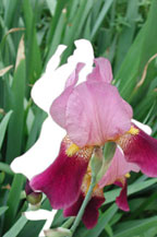
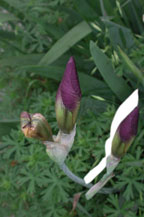
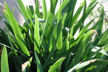
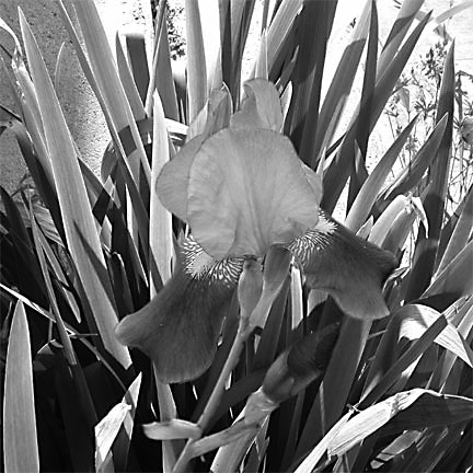
There are two flowers in the flower photo I chose and I only want one. I didn't want the leaves from this photo either because I had another that I like the lighting and coloration on them better. I want another element as well, a bud. Again, I only want one. And then there is the photo of the leaves I prefer. Just in case you didn't notice, let me point out that none of these photos are that perfect one I was talking about. They weren't meant to be. They were taken as merely reference photos and are only three of the many I took that day of these irises. I took pictures from the front, back, top, inside, single flowers, multiple flowers, up close, further away, buds, different clumps of leaves. You get the picture? You need to make copies of your photographs if you're not going to sketch your line drawing. Black and white copies will do just fine. You do need to keep in mind that if you're working from more than one photo that the proportions make sense. We don't want a 4-inch flower with 2-inch tall leaves and a 6-inch bud. So, you might have to use different percentages when copying to keep a check on reality. Or if you have a scanner, scan them into your software program, adjust, and print them out. Remember, they are you're photographs so you can copy to your hearts content. Black and white copies made on a color copy machine or with your scanning software set to scan 256 shades of gray will retain the different levels of gray within the design; they won't just be black and white. Retaining the gray levels isn't necessary to create a line drawing, but can aid in visualizing the value placements when you start to paint. And, of course, you can copy or print in color. Lay a piece of tracing paper over each copy of the different elements that you want in your design and trace them in place with a pencil. You may have to move and rotate your copies to align them in their correct positions. Now, you're ready to transfer your own design to your piece to paint it. If it's difficult for you to see through the tracing paper, you can substitute a piece of plastic wrap for the paper and an ultra fine tipped permanent marker for the pencil. This is not permanent, however, and you would need to place a blank sheet of copy paper behind your design and copy or scan it to make it permanent. You could also scan your photos into your computer and use photo editing software to replicate the above. I won't go into the advantages of learning to just sketch your design using your photos except to say that the process becomes much faster. And, if you can trace some elements and sketch in others, maybe leaves or filler, you will learn to sketch everything sooner.
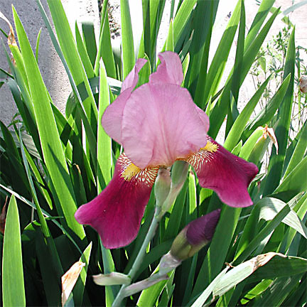
To illustrate the concept of what we're trying to accomplish, I've used software to extract the iris and bud and place them on top of the leaves to create the composition I want. Notice I've extended the length of the leaves from the original photo to accommodate the flower. Yours would be a line drawing free of any extraneous stuff like my concrete porch as a background and the weeds growing in my perfectly manicured flowerbed. I would have to trace this, leaving out what I don't want to make a line drawing. From this point, the design could be painted in whatever style you choose, from stylistic brushstrokes, to painterly impressionistic, to realistic. I've also included a gray scale photo. See if the different values with in the design are more noticeable to your eye. Painting different values within a design is one of the techniques used to create the appearance of depth on a two dimensional surface. Photographs really help us to learn to see values because our brain and eyes work together to correct what film cannot. Our eyes will often open up the shadows and tone down the highlights. When analyzing a photo for painting, don't look at it as a whole. That's scary. Look at each item separately from anything else as you paint it. For instance, just look at one leaf at a time in this photo. We can all paint one leaf, right? Let's look at the tall leaf on the left, the one that the petal of the iris just barely overlaps. It looks almost outlined with a very light color. From there the color blends into a little darker value with streaks of an even darker value in the middle. See the still darker value of the shadow of another leaf that is being cast on it. Notice how the shadows almost become black as they go deeper into an area where the light isn't as strong. The bud I chose to use was in a shadowed area in the original photograph. I placed it in a shadow area in this composition so I wouldn't have to do much to adjust it, by deepening shadows or adding highlights, to make it fit in it�s new home. While that statement may sound good it's not totally true. I really put it there because that's where I wanted it, but I did choose that one because I knew I wouldn't have to adjust it much. If I only had a picture of a brightly lit bud, I could still use it and adjust it to fit. See. Notice in the color photograph that it is easily separate from the leaves behind it. But look at the gray scale. You can barely see it. Why? Because the value of the bud and the value of the shadows behind it are almost the same although the colors are different. In this case it is the color that is making the distinction between objects although you could lighten its edges a tad if you needed to. Not too much though. Lightening it would start to bring it forward. Let�s look at the flower. Again, it doesn't have to be seen as a whole. You can break it down into one petal, one curve of a petal, one section of a petal at a time then paint what you see there, adding shadow or highlights where you think it needs it to make it fit and make sense. I hope this gives you a starting point for creating your own designs from your photographs. For practice, feel free to download and paint this one.
|
|
|
|
�2001-2003 Elsa Riedel |
|
|
|
All rights reserved. |
|